
Our goal was to create a brand narrative designed to expand overtime to improve relevance and create connections between our customers and Canadian farmers. To achieve this goal we have created a digital hub connecting these two main audiences. On the one hand, we wanted to inform, guide, and support prospective and current customers to ensure they receive maximum value from Canadian cereals products through personally-tailored, digitally-driven, self-managed, always-on, conversations with the faces of the Canadian Cereals community. On the other hand, we wanted farmers to help drive the Cereals Canada ecosystem through their stories and actions, and to elevate the brand by showcasing their relentless commitment. That's why we have designed the platform for constant, ongoing conversation where we listen, empower them, inspire them, and reveal their true contribution to creating a sense of pride and ownership.
What we do matters, and we all have a role to play. It's not just about the business of growing and selling cereal crops. It's about moving things forward responsibly, for everyone. Together, we nourish what matters most. The planet and local wildlife through responsible farming practices. The economy through expansion and growth. And people across the globe, with premium cereals products on tables everywhere. We are Cereals Canada. Let's continue to advance nourishment, and move forward together.
The Cereals Canada logo symbolizes our primary goal of moving forward together in the quest for more advanced, responsible and innovative ways to continue nourishing the world today and tomorrow. The minimalist and modern symbol features a bundle of grain straw arranged in the letter "C" and an arrow pointing to the right, indicating our common focus on growing for good.


Our colour palette reflects our identity. The primary gold derived from our products symbolizes our golden standards and ongoing organizational commitment to evolve, advance and innovate in our efforts to nourish the world. It is contrasted with slate the foundation on which fresh and healthy ideas that nourish our brand can thrive.


The official fonts of Cereals Canada brand are Acumin Pro and Le Monde Livre Classic. Acumin Pro is a modern, versatile neo-grotesque sans-serif typeface. It’s minimalist design and clear appearance emphasizes bold, forward-looking and transparent character of our brand. The Acumin Pro was paired with Le Monde Livre Classic, a Renaissance-style serif typeface that has been chosen for its human and natural character reflecting inclusive and conversational aspects of the Cereals Canada brand.


Icons are important elements of a visual expression of our brand, services, and tools. They are kept in a minimalist, modern style derived directly from our symbol. All icons should maintain the same line thickness.


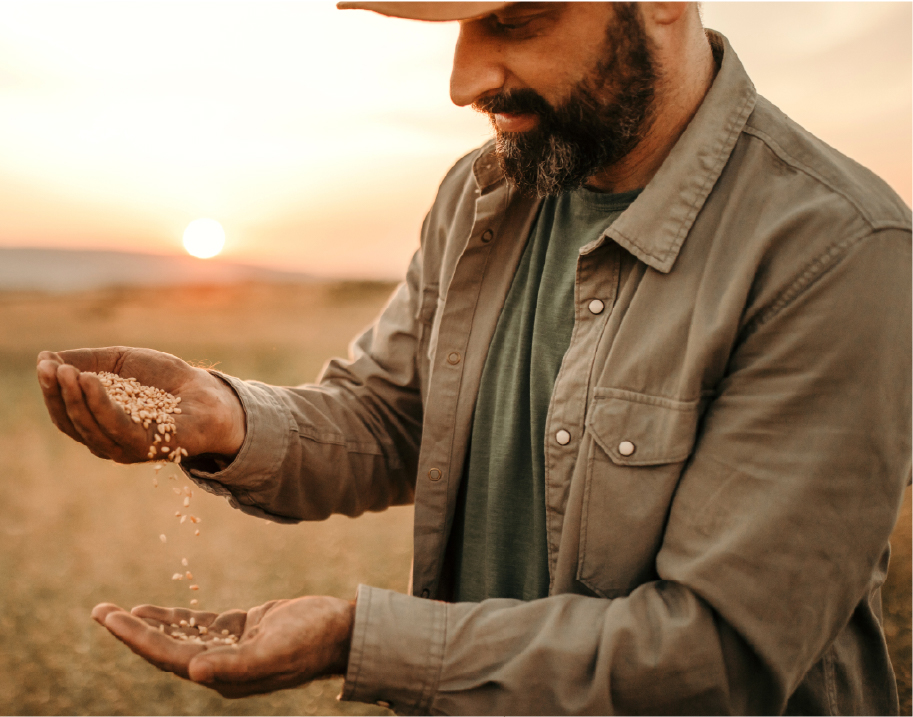
Our hero is our product supported by the community of growers and producers. We bring warmth and humanity to our communication by using natural images of cereals and cereal products supplemented with photos of authentic people involved in the production process.
Our photography draws from the brand’s colour palette, using rich golds, dark blues, and deep vibrant reds. Shallow depth of field can add focus and humanity. Photos can be overlayed with a Slate or Gold coloured scrim for legibility when text is required to sit on top of an image.


Our goal was to create a brand narrative designed to expand overtime to improve relevance and create connections between our customers and Canadian farmers. To achieve this goal we have created a digital hub connecting these two main audiences. On the one hand, we wanted to inform, guide, and support prospective and current customers to ensure they receive maximum value from Canadian cereals products through personally-tailored, digitally-driven, self-managed, always-on, conversations with the faces of the Canadian Cereals community. On the other hand, we wanted farmers to help drive the Cereals Canada ecosystem through their stories and actions, and to elevate the brand by showcasing their relentless commitment. That's why we have designed the platform for constant, ongoing conversation where we listen, empower them, inspire them, and reveal their true contribution to creating a sense of pride and ownership.
What we do matters, and we all have a role to play. It's not just about the business of growing and selling cereal crops. It's about moving things forward responsibly, for everyone. Together, we nourish what matters most. The planet and local wildlife through responsible farming practices. The economy through expansion and growth. And people across the globe, with premium cereals products on tables everywhere. We are Cereals Canada. Let's continue to advance nourishment, and move forward together.
The Cereals Canada logo symbolizes our primary goal of moving forward together in the quest for more advanced, responsible and innovative ways to continue nourishing the world today and tomorrow. The minimalist and modern symbol features a bundle of grain straw arranged in the letter "C" and an arrow pointing to the right, indicating our common focus on growing for good.
Our colour palette reflects our identity. The primary gold derived from our products symbolizes our golden standards and ongoing organizational commitment to evolve, advance and innovate in our efforts to nourish the world. It is contrasted with slate the foundation on which fresh and healthy ideas that nourish our brand can thrive.
The official fonts of Cereals Canada brand are Acumin Pro and Le Monde Livre Classic. Acumin Pro is a modern, versatile neo-grotesque sans-serif typeface. It’s minimalist design and clear appearance emphasizes bold, forward-looking and transparent character of our brand. The Acumin Pro was paired with Le Monde Livre Classic, a Renaissance-style serif typeface that has been chosen for its human and natural character reflecting inclusive and conversational aspects of the Cereals Canada brand.
Icons are important elements of a visual expression of our brand, services, and tools. They are kept in a minimalist, modern style derived directly from our symbol. All icons should maintain the same line thickness.
Our hero is our product supported by the community of growers and producers. We bring warmth and humanity to our communication by using natural images of cereals and cereal products supplemented with photos of authentic people involved in the production process.
Our photography draws from the brand’s colour palette, using rich golds, dark blues, and deep vibrant reds. Shallow depth of field can add focus and humanity. Photos can be overlayed with a Slate or Gold coloured scrim for legibility when text is required to sit on top of an image.
The Nissan Dealer App was designed to help dealership sales teams provide a seamless and interactive car-buying experience. The app streamlined vehicle presentations, financing options, and inventory browsing. My role as a Product Designer involved leading the UX/UI design and ensuring a visually compelling, intuitive experience tailored for in-store interactions.
Nissan & Infiniti sales representatives needed a more efficient way to showcase vehicles and personalize the buying process, as customers struggled to compare models and financing options using paper brochures. The existing digital tools were outdated, making sales conversations slow and disjointed, while sales teams lacked a dynamic way to present vehicles beyond showroom tours. The goal was to enhance efficiency, boost customer engagement with an interactive, digital-first approach, and increase conversions by streamlining financing and purchasing. The key challenge was designing an intuitive interface that catered to both tech-savvy and less-experienced sales staff while ensuring an engaging customer experience.
We conducted dealership visits, interviewing sales teams and observing customer interactions. Key insights revealed that sales reps needed quick access to inventory, side-by-side model comparisons, and a way to highlight financing incentives. Competitive Analysis: We analyzed competitor solutions and found that interactive digital tools significantly boosted customer confidence in purchasing decisions. Key Insights: A personalized experience (saving favorite models, customizing features) would enhance customer engagement. A faster, more visual interface (high-quality imagery, 360° views, and video integration) would make model presentations more compelling.Offline functionality was crucial, as some dealerships had unreliable Wi-Fi.

I collaborated with UX researchers and product teams to map out the app’s core features, aligning them with the dealership workflow outlined in the site map. Prioritizing speed and ease of use, we structured the navigation to streamline customer interactions—from exploring inventory and comparing models to financing options and delivery scheduling. Wireframes were designed to ensure seamless transitions between key touchpoints, enhancing both the dealer’s efficiency and the user’s experience.

The Sales Tracker in the Nissan Dealer app guides the delivery process through several key steps to ensure a smooth experience for the customer. It begins with a consultation to understand the customer's needs, followed by ensuring delivery readiness, customer onboarding and sending a link to download the MyNISSAN App, which provides easy access to important vehicle details. They also receive a link to connect with NissanConnect® Services, enabling remote management of vehicle functions. Finally, during the delivery, the dealer summarize key vehicle features, introduces helpful owner’s resources, and schedules the first service appointment, ensuring a comprehensive and customer-focused handover.


The consultation allows customers to explore available models and features while refining their search based on budget, trim, and preferences. The Discover tab provides in-depth model details, enabling side-by-side comparisons of trims and competitors, while the Inventory tab allows VIN-specific searches to check real-time availability. Dealers assist by guiding customers through these options, ensuring they find the right fit. This approach simplifies the research process, reducing the need for multiple sources of information and ensuring customers have up-to-date inventory insights for more informed decisions.


In the Trim Selection step through the Inventory tab, customers can refine their search by filtering available vehicles based on trim levels, features, and specifications. By accessing the VIN Detail Page, they can explore real-time inventory, comparing trims side by side to assess differences in performance, technology, and design. Filtering options streamline the selection process, allowing users to quickly find a vehicle that matches their preferences while dealers assist by providing insights into availability and key distinctions.


I led the design strategy for Fiber Fast, a broadband service targeting general population shoppers seeking reliable, no-hassle internet at a transparent low price. My role involved creating a seamless digital experience that provided clear, straightforward information to help users make confident purchasing decisions. The project focused on improving transparency, ease of use, and trust through a user-friendly interface that aligned with their research behaviors and decision-making process.
Fiber Fast shoppers seek a straightforward, reliable internet service with transparent pricing but struggle to find clear, hassle-free information when choosing a provider. They do minimal research and rely on word-of-mouth recommendations before visiting a provider’s website, yet often encounter confusing plans and a lack of upfront pricing, making decision-making frustrating.From a business perspective, the goal was to streamline the digital experience to clearly communicate Fiber Fast’s value proposition, making it easy for users to understand plan benefits, pricing, and reliability. The challenge was designing an intuitive, user-friendly experience that quickly built trust, reduced friction in decision-making, and increased conversions for first-time customers. The evaluation criteria focus on three key aspects: availability, ensuring that all necessary content for a purchase decision is present on the site; accessibility, confirming that product information is easy to find and understand; and relatability, assessing whether Fiber is presented in a way that effectively connects with our target audiences.
Our research combined qualitative and quantitative methods to uncover user behaviors and pain points. We conducted surveys and in-depth interviews to capture firsthand frustrations and expectations from Fiber Fast users, Gamers, and Movers. Data analysis included reviewing engagement metrics, churn patterns, and customer support inquiries to identify recurring trends in decision-making and service challenges. Competitive analysis benchmarked industry leaders and disruptors, assessing best practices in UX, messaging clarity, and pricing transparency. Insights from this research shaped key solutions: upfront pricing to eliminate confusion, a centralized dashboard for seamless service management, priority support channels tailored to each user segment, and targeted landing pages to improve engagement—creating a more intuitive and effective user experience.


Our design process focused on creating a seamless, user-centered experience through iterative refinement. We began with creating wireframes, mapping key user flows while ensuring a consistent usability framework across Fiber Fast users, Gamers, and Movers. While the core experience remained the same, content and visual elements were customized to each group. A scalable design system maintained consistency, featuring a modular UI for quick offer scanning. Key features included an engaging marquee with the core value proposition of AT&T Fiber, highlighting its emotional and practical benefits; transparent pricing and speed tiers for easy comparison; and a unified section showcasing unique Fiber Fast features like All-Fi, SHM, and Security. We also included a competitor comparison for added clarity, real customer testimonials for trust, and clear AT&T claims to reinforce its credibility as a leader. The site also featured a FAQ section to address concerns and a clear CTA for users seeking more information, ensuring a smooth, user-friendly experience.


The UI design for the AT&T Fiber page prioritized clarity, efficiency, and personalization within a unified framework. We developed a seamless, user-centered experience using a scalable design system that maintained consistency while adapting content and visuals to different user segments.


Our goal was to create a brand narrative designed to expand overtime to improve relevance and create connections between our customers and Canadian farmers. To achieve this goal we have created a digital hub connecting these two main audiences. On the one hand, we wanted to inform, guide, and support prospective and current customers to ensure they receive maximum value from Canadian cereals products through personally-tailored, digitally-driven, self-managed, always-on, conversations with the faces of the Canadian Cereals community. On the other hand, we wanted farmers to help drive the Cereals Canada ecosystem through their stories and actions, and to elevate the brand by showcasing their relentless commitment. That's why we have designed the platform for constant, ongoing conversation where we listen, empower them, inspire them, and reveal their true contribution to creating a sense of pride and ownership.
What we do matters, and we all have a role to play. It's not just about the business of growing and selling cereal crops. It's about moving things forward responsibly, for everyone. Together, we nourish what matters most. The planet and local wildlife through responsible farming practices. The economy through expansion and growth. And people across the globe, with premium cereals products on tables everywhere. We are Cereals Canada. Let's continue to advance nourishment, and move forward together.
The Cereals Canada logo symbolizes our primary goal of moving forward together in the quest for more advanced, responsible and innovative ways to continue nourishing the world today and tomorrow. The minimalist and modern symbol features a bundle of grain straw arranged in the letter "C" and an arrow pointing to the right, indicating our common focus on growing for good.
Our colour palette reflects our identity. The primary gold derived from our products symbolizes our golden standards and ongoing organizational commitment to evolve, advance and innovate in our efforts to nourish the world. It is contrasted with slate the foundation on which fresh and healthy ideas that nourish our brand can thrive.
The official fonts of Cereals Canada brand are Acumin Pro and Le Monde Livre Classic. Acumin Pro is a modern, versatile neo-grotesque sans-serif typeface. It’s minimalist design and clear appearance emphasizes bold, forward-looking and transparent character of our brand. The Acumin Pro was paired with Le Monde Livre Classic, a Renaissance-style serif typeface that has been chosen for its human and natural character reflecting inclusive and conversational aspects of the Cereals Canada brand.
Icons are important elements of a visual expression of our brand, services, and tools. They are kept in a minimalist, modern style derived directly from our symbol. All icons should maintain the same line thickness.
Our hero is our product supported by the community of growers and producers. We bring warmth and humanity to our communication by using natural images of cereals and cereal products supplemented with photos of authentic people involved in the production process.
Our photography draws from the brand’s colour palette, using rich golds, dark blues, and deep vibrant reds. Shallow depth of field can add focus and humanity. Photos can be overlayed with a Slate or Gold coloured scrim for legibility when text is required to sit on top of an image.
Goodcell is a biotechnology company focused on personal bio-banking (storage) of stem cells, plasma & DNA and diagnostic genetic screening. Goodcell’s advisors are visionaries in stem cell science and key medical and scientific fields such as oncology and cardiology. The new brand messaging presents the company as a place where science meets life. Taps into unrealized potential of each person to make the most of a singular life. To turn “could” to “can”. To add years to your life and life to your years. To squeeze every last glorious drop out of what if and make it what is.
We are pathfinders. On one hand we are deliberate, evidence-based, understandable, visionary, trustworthy, and forward thinking, on the other hand we are human, curious, optimistic and empathetic. We have a power to bring science to life.
Our mission is to empower people to live longer, healthier lives by using their own blood for dynamic and comprehensive diagnostics and ultimately life-saving cell therapies.
The vision is to shape the future of personalized health as today’s science becomes tomorrow’s medicine.
We’re curiosity driven explorers relentless in our search to find the answers needed to unlock the potential in the human body. Our wordmark is a clean and modern reflection of our character with a built in nod to our curiosity. It can be used in all formal brand communications. Depending on usage, it can be applied with or without the accompanying brand tagline "Life. Changing. Science."
Our colors keep us bold and distinct. Gunmetal and White create a strong, timeless foundation on which the bold, colorful and energetic ideas that drive our brand forward can play out.
Typography is the messenger of our voice, and carries our tone of voice across the brand. Our typographic style reflects us — life meets science, character meets precision.

Mabry is a vernacular study in dualities. With one foot amidst the quirky forms of the late 19th Century grotesks, and the other among the rational maths of early 20th Century geometric sans-serifs, Mabry posits itself as several things at once: simultaneously rigorous and gestural, cultivated and imprecise. This duality of character-meets-precision makes Mabry the ideal headline face for carrying our short, bold headlines.

Calibre is precise, but friendly. It's modern, clear, legible and perfect for carrying the body of our message. We use Calibre for body copy or secondary treatments in both regular and light weights.


Our brand exists at the intersection of life and science and the photographic styles we use reflect this. On one side, leaning into life's twists and turns, documenting them in full color. On the other, we strip back the color, using a technical precision that hints at the rigor of science. When juxtaposed together this interesting duality creates a pleasing tension in our work.
As an abstract concept, potential can be challenging to communicate through real-world photography alone. We look to illustration and still life to convey ideas about the possibilities that our work offers to people, science, and medicine.


Icons convey the "life meets science" idea in a small footprint. Our icons comprise of a precise line drawing combined with a looser shape at larger sizes and reduce down to a line drawing at smaller sizes. All icons are built on a 48x48 px grid, with 4px of safe space on all sides. Icon stroke weights are always kept to 2px.


Clara Lionel Foundation (CLF) is a charitable organization founded in 2012 by singer Rihanna, and named after her grandparents. It has backed a number of causes in recent years, but their current focus is supporting emergency preparedness and response programs in the Caribbean. To that end, CLF is aiming to support climate resilience - the process by which communities can fortify and prepare for climate change and climate-related disasters. In a very noisy social impact space, they asked us to develop the consumer-facing brand, language, and calls-to-action to help this cause stand out.
In our research, we found that only 6% of disaster aid goes to resilience, preparedness, and risk reduction. This means that disaster aid is mostly very reactive. Using this knowledge, we created a campaign brand that empowers people and communicates resilience to climate change. Our mission was to stand out, spark a movement, empower individuals by uniting communities, and be perhaps one step closer to standing under Rihanna's umbrella. To achieve these goals, we have created a strong brand that reflects the urgent need to act together in the face of the climate crisis. The concept was rooted in a widespread, strong heroic sense of being the last generation to make a difference. This is how The Last Resort brand was born.
The Last Resort mark reflects our resilience and readiness in the face of the climate crisis. A strong defensive typographic wall built with the custom modern font portrays our readiness for what’s coming as well as our determination to defend people affected by the crisis. The negative space wave over the word ‘resort’ speaks to the urgency in the face of a climate disaster.
As Haiti is ground zero in the climate crisis, the primary colors red and black have been taken from the Haitian flag. They have been balanced by a blue called Caribbean Azure and complemented by the color of a Haitian beach.
Our brand is strong and actionable and the photographic styles we use reflect this. We use a blend of portraiture and reportage imagery depicting the authentic human stories dramatically shifted by the natural disasters. By showing the authentic people we empower and the impact we have in their lives, we bring warmth and humanity into our communications.
CLF community, activists, volunteers, and donors. These are the brave ones — heroes for our brand. We apply the collage style to spotlight the heroes that guide us forward.
The climate crisis is a delicate matter since it is often associated with human suffering. Using too many real photos of natural disasters can sometimes feel insensitive and overwhelming, paradoxically creating desensitization as a defense mechanism in viewers. Therefore, in cooperation with Synthia Saint James, we wanted to propose a specific style of illustration, presenting real events in a more abstract, but still impactful way and helping our brand to stand out.


The White Rabbit is the perfect digital product for families. It focuses on indoor children's' activity. It allows children to engage with their evening routine in an exciting and fun way using their beloved cartoon characters as a guides. The product combines narration with digital experience and physical activity in a smart home environment. It is a 'fluid interface' that utilizes the existing digital environment to create a seamless cross-device experience for the user. The app allows parents to fully customize the themed scenarios to tailor them to their children's specific needs.

To help 5-7 years old children to move seamlessly from daily physical activity to the bed time in a fun way.

The White Rabbit is an app that allows to connect smart devices at home to push consecutive themed messages and create one seamless narrative experience for children. It can also work independently on the one mobile device.

The application is to be developed in cooperation with distributors of children's films, which are one of the main stakeholders.

The system uses technology that allows connect smart devices across entire house to create one narrative experience.

Children follows the messages of their beloved fairy-tale character pushed through the smart devices placed around the house.

The App allows to create the profile of the child with its favourite cartoon themes. It also allows to locate and connect devices using bluetooth beacons.


While working for Factor for its largest client - Google, I had the opportunity to collaborate on creating a new YouTube ad site. The main challenge was to design an engaging and inspiring small business guide and to showcase the full potential of YouTube advertising.


Krakow, an old town in southern Poland near the border with the Czech Republic, is famous for its well-preserved medieval centre, castle and Jewish quarter. The publication consists of urban legends related to this former capital of Poland, arranged chronologically. The design challenge was to design a book cover that would reflect the historical nature of the publication in a modern way. I decided to create a minimalist illustration consisting of legendary figures associated with the city.


The book is a collection of famous Twitter battles ranging from celebrity feuds (like Katy Perry vs Taylor Swift) to Donald Trump vs Everyone. The publication ironically focuses on the dark side of this social platform, which for many people has simply become another place to boost their ego. The design challenge was to create the book cover that reflects the ironic tabloid character of a publication.


The book was written by one of the greatest Polish specialists in epidemiology. It is a compendium of knowledge in the field of tropical medicine aimed at doctors and medical students. The cover of the book refers to engravings and sketches in explorers' journals interpreted in a modern illustration style. The red colour piercing through the thicket of tropical plants symbolically warning about health risks waiting for travellers.


The cover of the Dictionary of Literary Genres was designed as a minimalist typographic island. It symbolizes all literary genres.


A collection of film reviews by one of the Polish reviewers published in a newspaper during the communist era. Book cover stylistically refers to the graphic design of this daily newspaper, including typography, colours and illustration style.


Mosaics Lab is a craft company that creates personalized hand made mosaics available to purchase via the online store. It is a modern brand aimed at the younger hip audience. The main challenge was to create an identity that reflects the brand promise: using ancient traditional craft techniques for creating modern, and relevant art. The solution was to create a minimalistic look and feel for the brand followed by the brand expression including a branded clothing line for the employees and brand lovers.


I was invited by Overdrive Design studio to rebrand one of the most iconic cultural institutions in Toronto. The main objective was to modernize the logo while retaining the brand equity established by the Festival. I followed this with a brand expression that reflects the international diversity of Jewish film – a core commitment of the TJFF. The project scope also included a new website.


Inspired by the facial markings of Canada’s indigenous birds, as well as by wildlife representations found in early native culture. The clean shape of The Mask duplicates the shape of the front windows and celebrates the flight deck. It’s primary role is to capture the experience of travel in creative. Across all touch points, this serves as a natural extension of the Air Canada brand. Echoing an aircraft’s windshields, it represents the spirit of the airline: welcoming and insightful. It also embodies Air Canada’s commitment to excellence.

The Mask and imagery come together to form collages. Much like real memories, these collages contain the snapshots and fragments of trips, bringing to life the essence of the travel experience with Air Canada.
The Mask is a visual system that was created to assist the Air Canada team in its daily marketing operations. It is a natural brand extension that gives the marketing and design team flexibility in creating impactful communication with the clients. The system consists of visual guidelines and templates dedicated to various channels and different marketing purposes.


I’ve done lot’s of work, let’s check some from here.
Get in touch with me today.


